MORE KNTXT


MORE IDENTITIES


In the execution of the Charlotte de Witte Overdrive EP and associated tour, our responsibilities encompassed the comprehensive development of visuals, merchandise, and overall brand identity. A feature of this project was the vinyl cover design, introducing an interactive element where physical scratching revealed two distinct covers, emulating the visual effect of car tire marks on the floor.
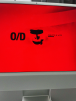
Integral to the project was the creation of the O/D logo, originally conceived for the "Overdrive" track. Subsequently, this logo found strategic placement in concert visuals and merchandise, ensuring a cohesive and recognizable brand identity throughout various mediums.
The strategic objective was clear – to not only aesthetically enhance the Overdrive EP and tour but to introduce a tangible and memorable aspect. The vinyl's interactive feature and the consistent use of the O/D logo served to elevate the visual and brand experience, offering a refined and impactful extension of Charlotte de Witte's musical narrative.