MORE IDENTITIES


The time for a new direction is now, for Inter and for European football as a whole. We face mounting challenges in our ever-more demanding world, both on and off the pitch, and across the globe. To truly transcend the stadium and the weekly game, football clubs need to evolve into global brands.
This doesn't just mean being present in society and sports; it's about actively shaping the broader consumer landscape (goods and content), communication channels, and ultimately, becoming fully-fledged entertainment companies. A century ago, football clubs' communication was limited to the 90+ minutes of a match. Today, it's 24/7 on social media. The way fans consume content and the brand identity required to connect with them have fundamentally changed.
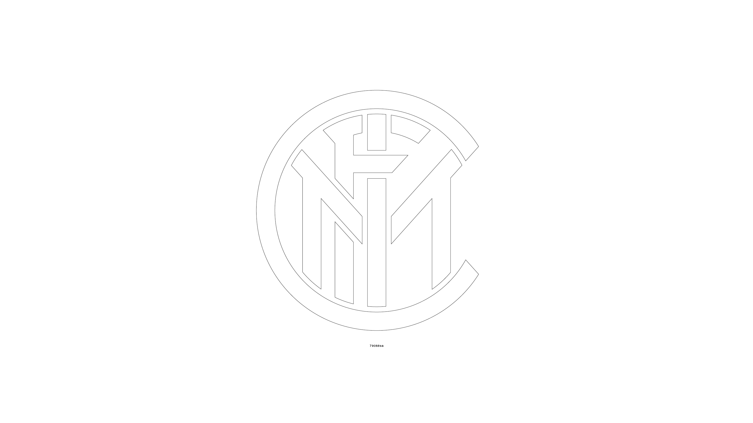
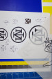
The lettering and character composition of the old crest was beautiful. At the same time, it was quite complex. The new crest focalizes on the I and the M. The "I" remains at the center of the crest. Though slightly modified, the "M" retains its unique overhanging arms. The symmetrical "M" remains behind the "I." The circular foundation of the rings also remain intact. Overall, the visual appearance of the new crest hints at the old one. The relation of space between letters and the whitespace in between remains almost the same (around 90%). And the overall surface area remains 96% the same.
The duality of Internazionale and Milano was essential for the redesign. The club is proud of its Milanese roots and of its international fan culture. This pride is exemplified and emphasized in the new crest. Internazionale "I" and Milano "M" are more prominent than ever before.
An important part of the redesign launch was a campaign under the motto "I am Milano, I am Inter", which was intended to emphasize the strong roots in the city and with the people of Milan. The most famous people from the club, the fan community and the city were part of this campaign.
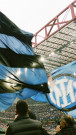
The club's colors were defined by Giorgio Muggiani in 1908, when he drew the original crest on the night of March 9th. Each color has a separate and specific significance. Ever since the club was founded, Inter has almost always worn black and blue stripes, which earned them the nickname 'Nerazzurri'. For the last 110 years, Inter's colors have only changed in gradation. We did the same. The blue is now more intense compared to the previous azure. The new saturation brings a modern and digital feel. The same applies to the gold. It now appears as a vibrant and powerful color – similar to the gold used in the iconic 90s jerseys.
At the end of the 2023/2024, Inter was crowned champion, winning their 20th league title. For this special and anticipated occasion we've prepared a celebration logo that would be used through the whole "IM2STARS" Campaign.